Redesign Learner Home
As Degreed’s user base entered a strong growth period and emerged as a big player in the LXP (Learner Experience Platform) market, it became clear that our Product Homepage needed a big update.
Users weren’t able to discover new resources swiftly and continue easily with the learning they had started, upon returning to Degreed. The latter was of great importance as we were preparing to enter the Career Mobility market, where developing upon current, and building new skills would be extremely crucial.
I led the design as part of the Learner Home Team. Over the course of a year I researched, designed, prototyped and tested the new experience, while also creating a set of new components to enable Degreed to scale-up to the next stage.
Team
Lindsay White
Product Manager
Guntars Asmanis
Tech Lead
Kandace Gordon
Front End
Caitlin Evans
Front End
Andrew Abernethy
Back end
Khalid Laouhi
Product Designer
Timeline
2019 - 2021

From feed to section-based
We recognized from the beginning on that the current newsfeed-like structure wasn’t going to be the right foundation for Degreed’s growth ambitions. We learned from gathered research, that users had a hard time discovering new or relevant content, due to the structuring of the layout.
Knowing that we wanted to facilitate personalized content and increase the data density, we came up with a section-based structure within the current grid layout, alongside a list of relevant content sections that would help with skill development.
Besides the layout change, we updated the sidebar to create easier access to self-owned resources, introduced focus skills to establish a personalized experience and added monthly activity data to show progression and increase intrinsic motivation.


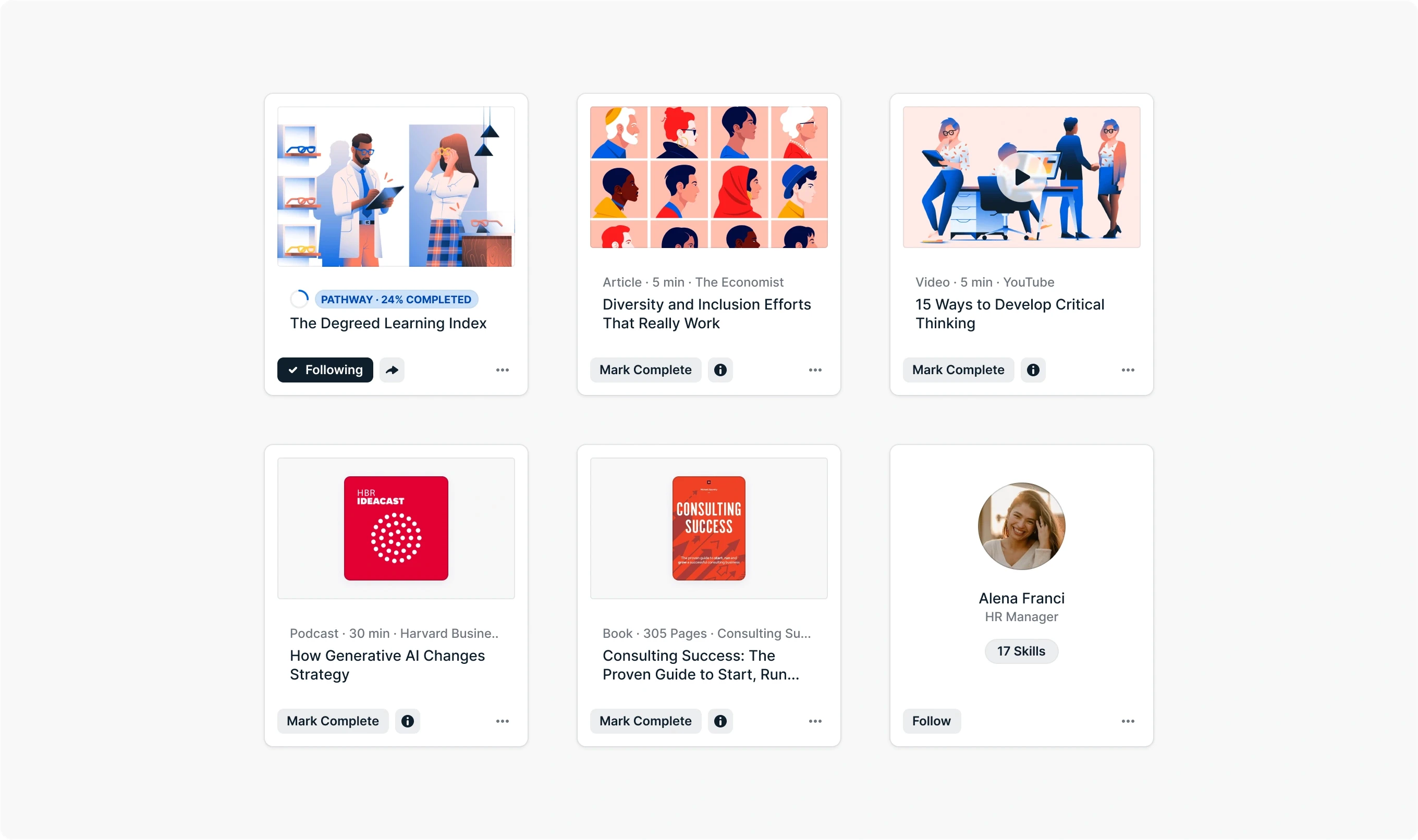
New content card design
Due to the change of layout on Home, we had to return to the drawing board for the content cards. The goal of this redesign was to increase consistency between cards and to simplify the overall experience. We were getting numerous bug reports about a vast selection of card variations living on the platform increasing the complexity when interacting with these cards.
The solution was to redesign the cards to fit the new layout, reduce the amount of elements and provide the user with relevant information enabling objective decision making while viewing the content. We intentionally decreased the size of the cards and created a more detailed view. So the overall experience would be less cultured and more focused.
We also took the opportunity to consolidate some user actions and gave the cards a refreshed and balanced new design, by introducing more hierarchy, updating the rounded corners and increasing white spacing, all resulting in a more focused and calm experience.

New way of uploading Images
As we were working on the Content Card we discovered that our upload process and the image cropper was desperately in need of an update. The flow wasn’t intuitive anymore, the aspect ratio in the cropper was deprecated and the overall look was obsolete.
By creating consistency across the product, updating the design and presenting clear feedback on the cropped image outputs we tackled these problems. The last one was of significant importance, as users tended to add logos on their images for brand awareness, while the images were being cropped for two different aspect ratios at the same time.
We also worked on improving clarity around the aspect ratios being used and educating users on what to do and not to do by creating documentation in the support center.


Business impact
Data from the Impact Analysis. Timeframe starting at general release October 2020 to July 2021.
Users clicking on content

Average content clicks per user

Users impressing content

© 2024 to infinity.